
Accessible Payment Page
Paying online should be possible for everyone. The PayXpert hosted Payment Page is designed for all shoppers, including those who are blind, have low vision, or rely on assistive technologies such as screen readers, screen magnifiers, keyboard-only navigation or operating system high contrast settings.
The payment page was designed against the success criteria of the Web Content Accessibility Guidelines (WCAG) 2.2, level AA, and was reviewed through an independent accessibility audit. It helps you offer an inclusive checkout, in line with the expectations of the European Accessibility Act for e-commerce services.
These accessibility features are available to every merchant by default: there is nothing to enable or configure, and no change to your integration.
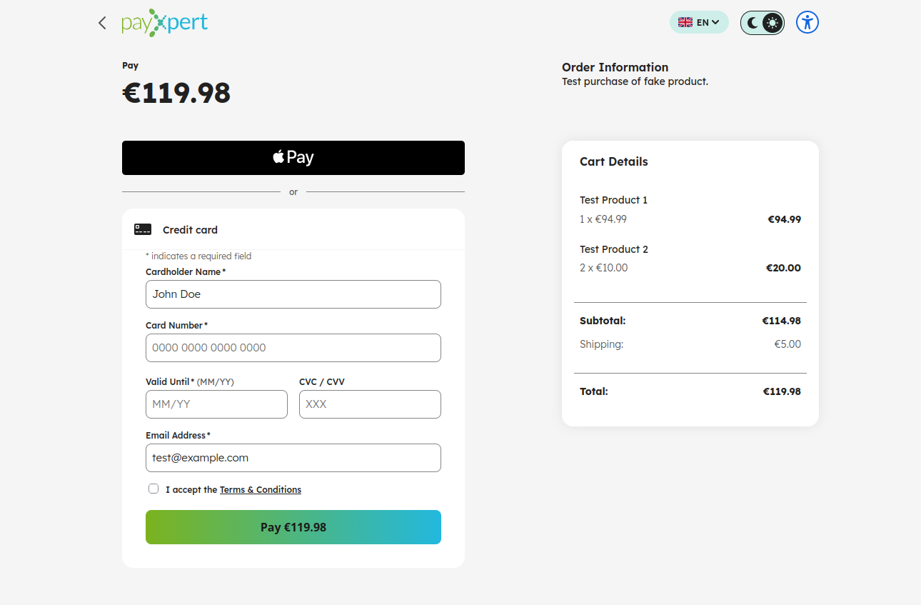
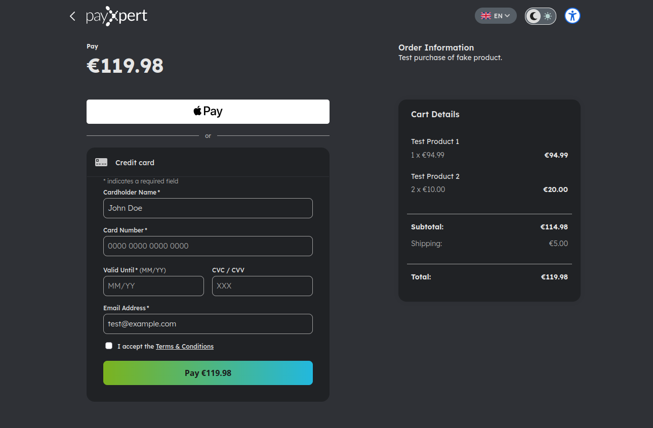
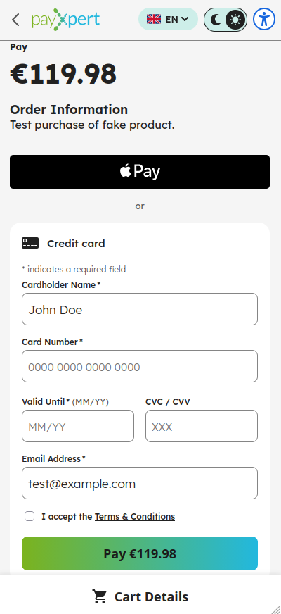
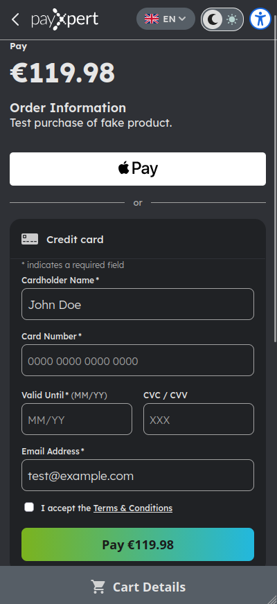
Shopper-controlled display preferences
An Accessibility options button in the page header opens a panel where the shopper adapts the page to their needs:

| Setting | Values | Purpose |
|---|---|---|
| Text size | Small, Medium, Large | Enlarges all text, including amounts and form fields. The layout grows with the text instead of clipping it. |
| Letter spacing | Small, Medium, Large | Increases the space between characters, which helps shoppers with low vision or reading difficulties. |
| High contrast | On / Off | Switches to a black and white palette with maximum contrast. |
| Dark mode | On / Off | Light text on a dark background, which reduces glare for light-sensitive shoppers. |
A visual indicator on the button shows that settings differ from the defaults.
The settings are applied before the page is displayed, so there is no flash of the default appearance. They are remembered in the shopper’s browser for their next payments.
The payment page also follows the shopper’s operating system or browser settings: a system dark mode or increased contrast preference is applied automatically, unless the shopper chose otherwise. Windows High Contrast (forced colors) mode is supported natively.
Presetting preferences from your website
If your own website already offers display preferences, you can carry them over to the payment page so the shopper does not have to set them twice. Add any of the following parameters to the payment page URL you redirect the shopper to:
| Parameter | Values | Default | Description |
|---|---|---|---|
theme |
light, dark |
light |
Color scheme |
contrast |
normal, high |
normal |
High contrast mode |
fontSize |
s, m, l |
s |
Text size |
spacing |
s, m, l |
s |
Letter spacing |
https://<payment page URL>?theme=dark&contrast=high&fontSize=l
Preset values apply to the current payment only, including the 3-D Secure step and the result page. They take precedence over the shopper’s saved preferences but never replace them. Unknown values are ignored.
Designed for screen readers
- Clear page structure: header, main content and footer landmarks, and a heading hierarchy that starts with the merchant name and the amount to pay. Screen reader users can jump directly to the information they need.
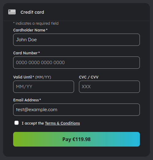
- Explicit labels: every field, button and control has an accessible name. The pay button announces the amount (for example “Pay €12.00”). Icon-only buttons such as close, back to merchant or language selection have text alternatives.
- Meaningful images only: logos and card brands have text alternatives, while decorative icons and flags are hidden from assistive technologies.
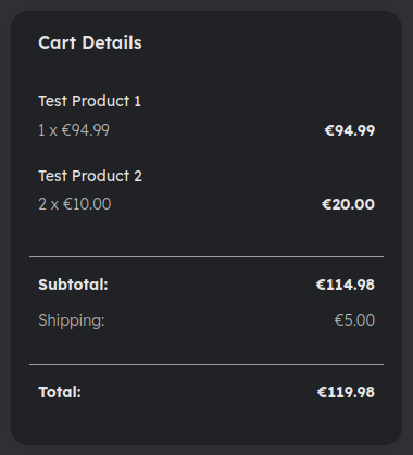
- Readable order summary: cart items are announced as a list with quantity, unit price and item total, and totals are structured as term/value pairs.
- Language support: the page declares its language, and each language in the language selector is announced in its own language and pronunciation. The page is fully translated into English, French, Spanish, German, Italian and Simplified Chinese.
Full keyboard navigation
- Every action can be performed with the keyboard, in an order that follows the visual reading order.
- A clearly visible focus indicator, preserved in Windows High Contrast mode, shows where the shopper is at all times. Focused fields are never hidden behind the sticky header or the mobile cart button.
- Dialogs (accessibility options, language selection, order summary on mobile) keep the focus inside them while open, close with the Escape key and return the focus where it was.
Accessible payment forms
- Autofill: card holder name, card number, expiry date, security code and email use standard autocomplete values, so browsers and password managers can fill them. Numeric fields bring up a numeric keypad on mobile devices.
- Required fields are marked visually and announced as required by screen readers, and the meaning of the asterisk is explained.
- Formatting help: the expected expiry date format is part of the field label. Spaces in the card number and the “/” in the expiry date are inserted automatically.
- Error handling: errors are not conveyed by color alone. Invalid fields are flagged to assistive technologies, each message names the field concerned, a summary gives the number of errors, and the focus moves to the first field to correct.
- Co-badged cards: when a card carries two brands, the shopper chooses the brand with a standard, fully announced radio button group.
Readability and low vision
- Contrast: text, borders, placeholders and focus indicators are tuned to meet WCAG AA contrast ratios in both light and dark modes.
- Readable typeface: the page uses Lexend, a typeface designed to improve reading fluency.
- Zoom and reflow: browser zoom is never blocked, and the layout adapts to large text and small screens without loss of content.
- Comfortable line length for long texts such as legal disclaimers.
Payment processing and 3-D Secure
- While the payment is processed, a status message (“Your payment is being processed. Please do not close this page.”) takes the focus and is announced, and the rest of the page is made inactive so the shopper cannot trigger a second payment by mistake.
- The 3-D Secure challenge of the card issuer is displayed in the same accessible overlay with a descriptive title, and the focus is moved into it automatically.
- The processing screen follows the shopper’s display preferences.
- Result pages clearly state the outcome of the payment in their main heading, and a failed payment that can be retried is announced immediately.
The content of the 3-D Secure challenge itself is provided by the card issuer, and its accessibility is the responsibility of the issuing bank.
Other payment methods
The same accessibility foundations apply to the other payment methods available on the payment page. QR code payments (WeChat Pay, Alipay) include a text description of the code and an announced error message if the code cannot be generated.